Skincare ranges often grow one product at a time, and their boxes can quickly stop looking related. A cream jar, serum bottle, sample kit, and seasonal set need different dimensions, yet buyers should still recognize one brand before reading the label. The solution is a packaging system with a few fixed identity cues, clear rules for variation, and enough space for market-specific product information.
Brand Recognition Comes From Repeated Cues
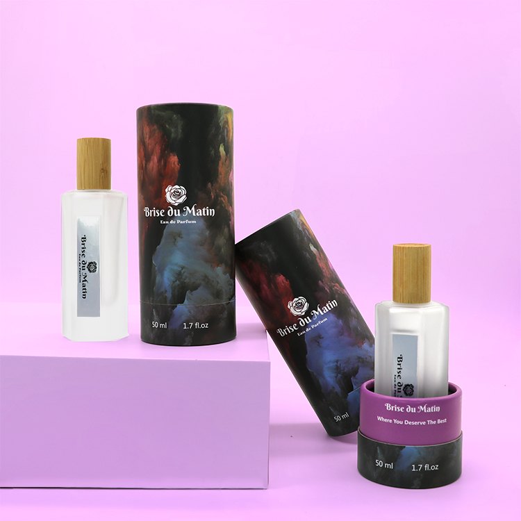
A coherent range repeats the same visual signals across every stock keeping unit. The logo position, primary typeface, color hierarchy, image style, and opening behavior should feel related even when the carton size changes. Repetition makes the family recognizable, while controlled variation helps shoppers distinguish a cleanser from a night cream or a core product from a gift set.
The design brief should separate permanent brand assets from product-level information. Permanent assets include the brand mark, typography, and a small group of structural or finish cues. Product-level fields include the product name, function, shade or formula variant, net content, language, and local regulatory text. This distinction prevents a new launch from quietly inventing a different visual system.
Structure Communicates Position Before Artwork
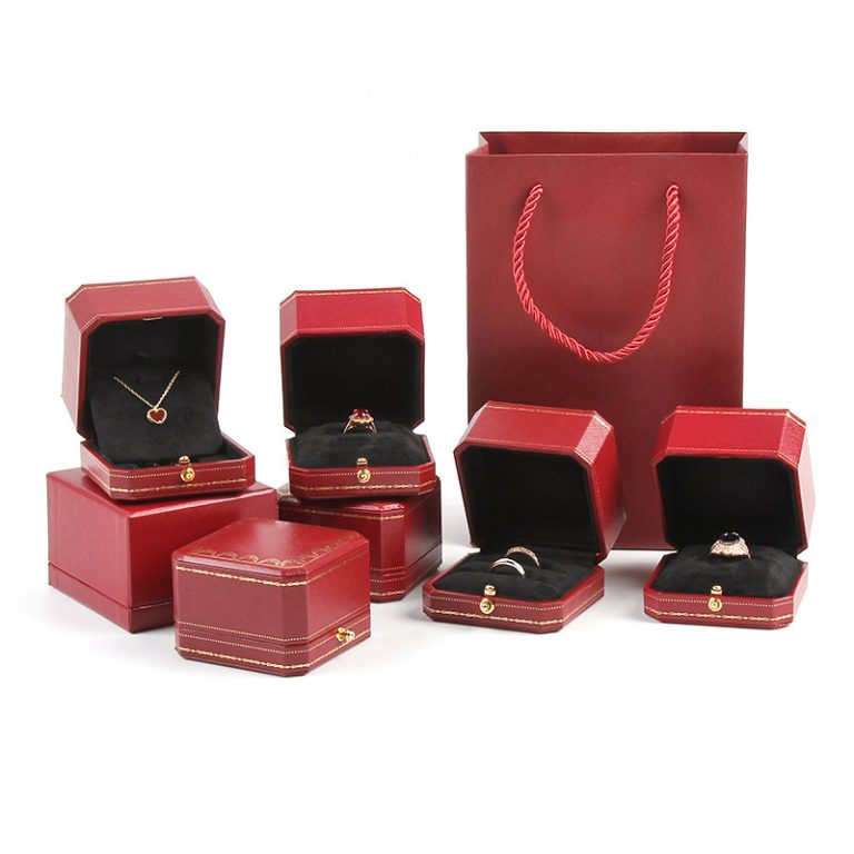
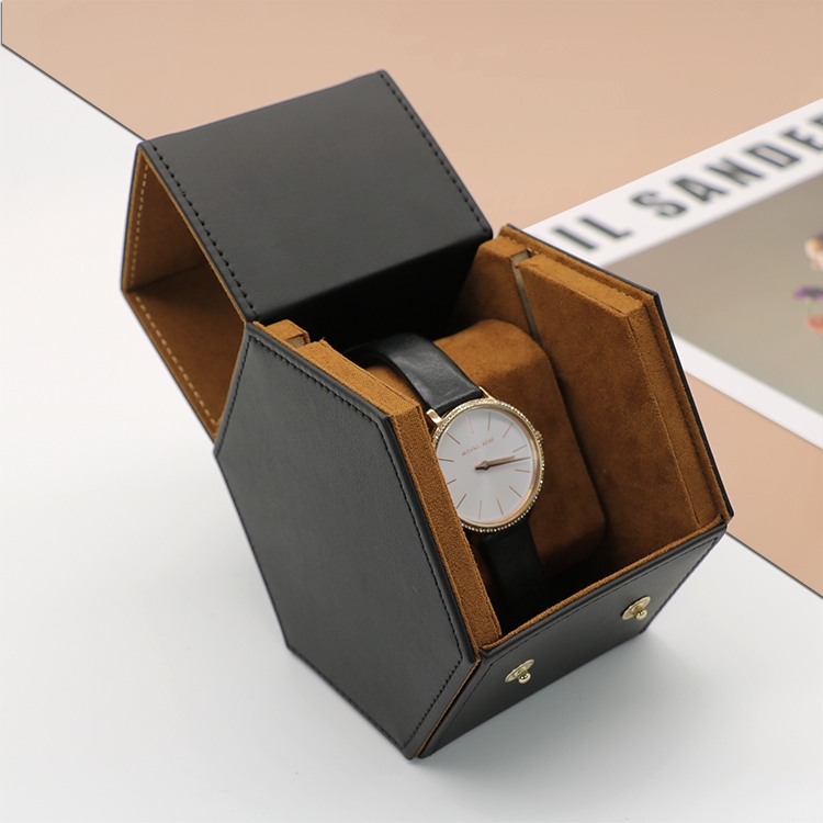
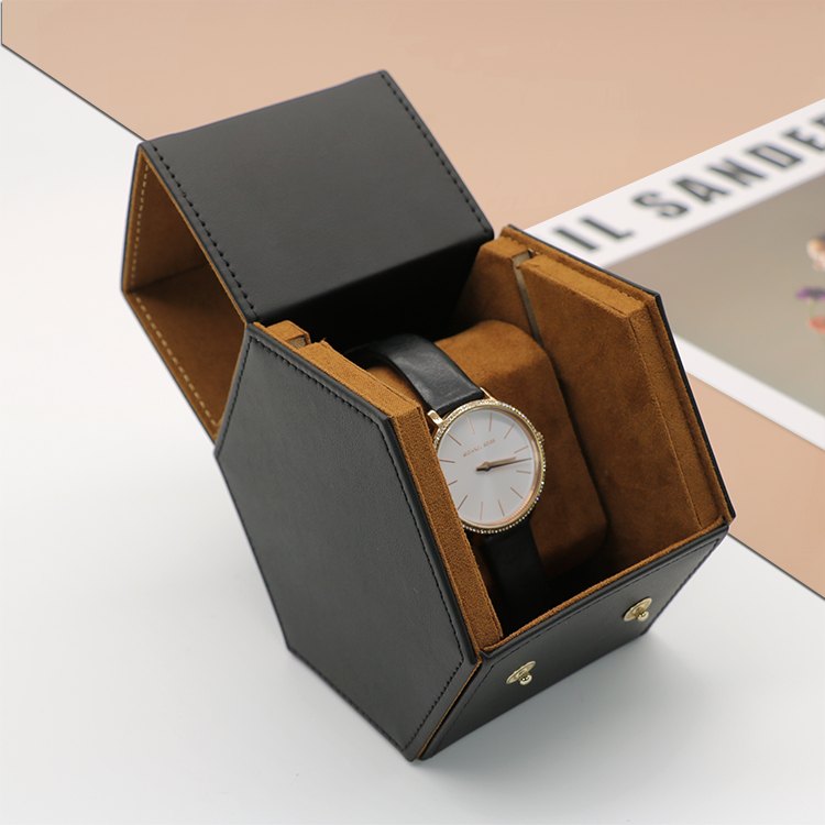
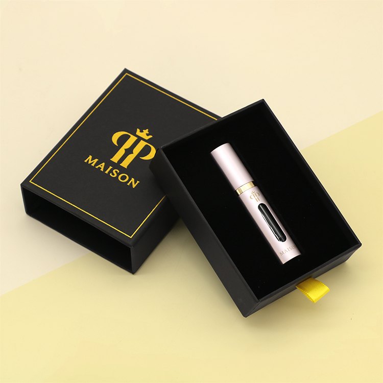
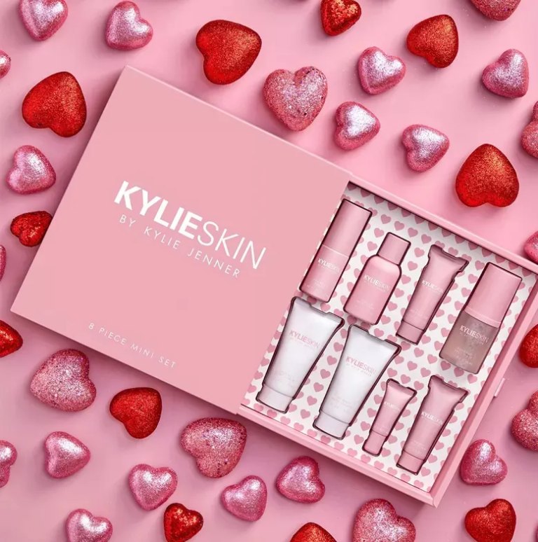
Box construction changes how the brand feels in the hand. A straight tuck carton is efficient for compact retail lines. A rigid lift-off lid creates a slower, more formal reveal. A drawer format adds a controlled opening gesture, while a book-style magnetic box can organize a multi-product set. Structure should follow the product, channel, and expected reuse instead of serving as decoration alone.
The interior is part of that identity. An insert can arrange bottles, jars, tubes, masks, or tools so the range reads in the intended order. JERL Packaging offers cardboard, EVA, EPE, sponge, pulp tray, blister, satin, and raffia filler among its insert options. Each material changes product support, appearance, and end-of-use handling, so the selected insert should be tested with the filled product.
Customized cosmetic packaging works best when the structural family remains recognizable while each format solves its own product-fit problem.
Information Hierarchy Protects the Brand System
Required information cannot be treated as leftover copy. In the United States, the outer cosmetic package normally needs a principal display panel for identity and net quantity, plus information panels for directions, warnings, business details, and ingredients where applicable. Great Britain likewise requires readable product information, and its rules can place items such as ingredients on the packaging when space is limited on the container.
These obligations affect the dieline at the start. A bold front panel loses its identity if later revisions squeeze mandatory text into random gaps. The brand team should reserve zones for product identity, net contents, ingredients, precautions, batch coding, language variants, and retail labels before approving decorative artwork. Local responsible persons must confirm the exact text for every destination market.
One Design System Must Stretch Across the Range
A useful system defines what stays fixed and what can change. This allows a buyer to add a new serum size or promotional kit without rebuilding the range from scratch.
Custom skincare packaging can then support different sizes without losing its visual grammar. JERL Packaging offers custom sizing plus rigid, coated, art, texture, corrugated, kraft, metallic, and holographic paper options for skincare gift boxes. The broad range is useful only after the brand limits it to a deliberate system.
Finishes Need a Defined Job
Finishes should make an important cue easier to notice or feel. Foil can emphasize a mark, embossing can create a tactile signature, and matte or soft-touch lamination can establish a consistent surface. Spot UV works best as a controlled contrast rather than a second visual language. When every panel competes for attention, the range looks less coherent.
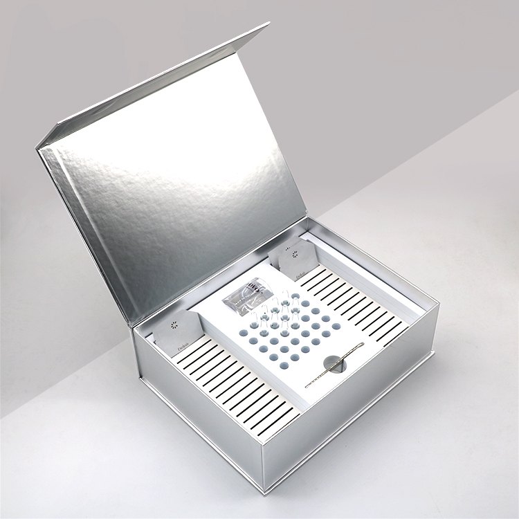
This skincare gift-box configuration supports CMYK and Pantone printing, varnish, matte or glossy lamination, anti-scratch or touch lamination, plus foil stamping, embossing, debossing, and spot UV. A physical sample should confirm color under realistic lighting, registration around edges, rub resistance, closure action, and the way the finish behaves on the chosen paper.
Strong beauty brand packaging gives one finish a recognizable role and lets product information remain clear.
Family Proofing Finds Problems a Flat File Misses
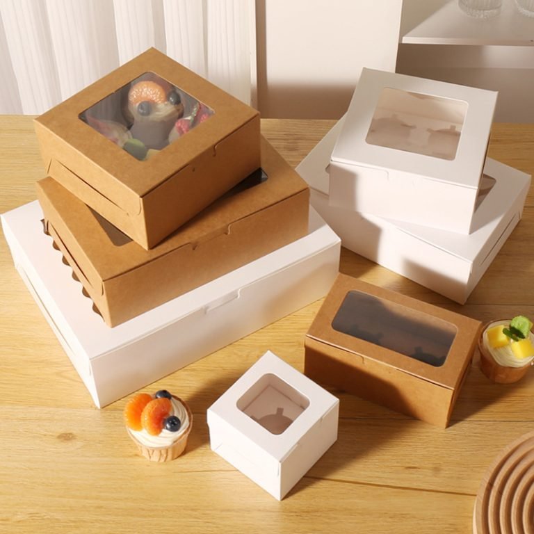
A single hero carton cannot prove the range. Build a small approval set that includes the narrowest carton, the widest front panel, the deepest insert, the longest product name, and one multi-product gift format. Place them together, then check logo rhythm, color relationships, readable information, product removal, and how the boxes align on shelf.
JERL Packaging offers flat views, 3D mock-ups, and physical sampling on request for its skincare gift packaging. For this configuration, preliminary timing is two to three working days for samples and 10 to 15 working days for mass production. Confirm timing against the final structure, quantity, artwork, and finish.
Consistency Should Survive Real Use
Skincare packaging builds identity when recognition, product fit, information, and finish work as one system. Fix a small set of permanent brand cues, define controlled SKU variation, reserve compliant copy zones early, and approve the range as a family rather than as isolated boxes. The design then remains recognizable through new products, gift sets, and market versions.
JERL Packaging can develop the dielines, materials, inserts, and physical samples around an approved brand system and the actual dimensions of each skincare product.
Häufig gestellte Fragen
What should stay consistent across a skincare range?
Keep the logo relationship, typography, core palette, information hierarchy, and one or two structural or finish cues consistent. Let size, SKU color, and cavity layout vary within rules.
When should regulatory copy be added to the dieline?
Reserve it before decorative artwork is approved. The final wording depends on the product and destination market, so the responsible compliance team should confirm each version.
Do all skincare products need the same box structure?
No. A jar, dropper bottle, tube, and gift set may need different structures. Shared opening cues, proportions, colors, and finish rules can still connect them.
Which insert is best for a skincare gift set?
The right insert depends on product weight, shape, removal path, presentation, and end-of-use goals. Test the filled items in the finished insert rather than selecting by appearance alone.
Why approve several cartons together?
A family review exposes inconsistent logo scale, color drift, crowded copy, and awkward shelf rhythm that may not appear when each package is approved separately.