
A small beauty range needs packaging that makes its products recognizable without turning every new shade into a complete redesign. For independent cosmetic brands supplying boutiques and distributors, a useful idea must work across the range and still suit the product inside. These seven approaches connect visual identity, product fit, and gift presentation in practical ways.
A shared color system with a clear product cue
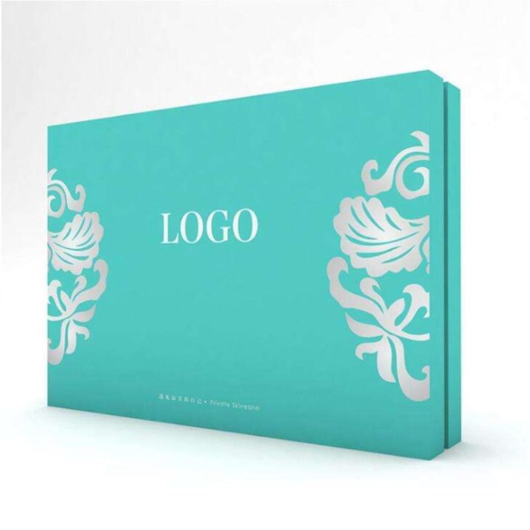
A common visual system gives each product a place in the range. Keep the logo position, type hierarchy, and main background consistent, then assign one controlled accent to a shade or formula. A lipstick and a cream jar can look related without making their cartons difficult to distinguish.
Physical color samples make that system easier to judge. Compare the proposed colors on the chosen paper and finish, with the product names in place. Leave enough contrast for the variant name to remain readable when a wholesale partner displays several products together.
A fitted interior that becomes part of the design
The interior can give a small product a deliberate position instead of surrounding it with excess space. A cream jar might sit in a shaped opening, while a bottle needs support suited to its profile. Keep fingers able to reach the container so the attractive arrangement also works when opened.
Matching that arrangement to the container requires more than changing the printed artwork. JERL Packaging provides customized internal structures and external dimensions; our custom cosmetic boxes can also use cardboard, foam, or pulp-tray inserts. Select and sample the assembly for the actual product rather than assuming those materials perform identically.
A drawer reveal for a signature lip product
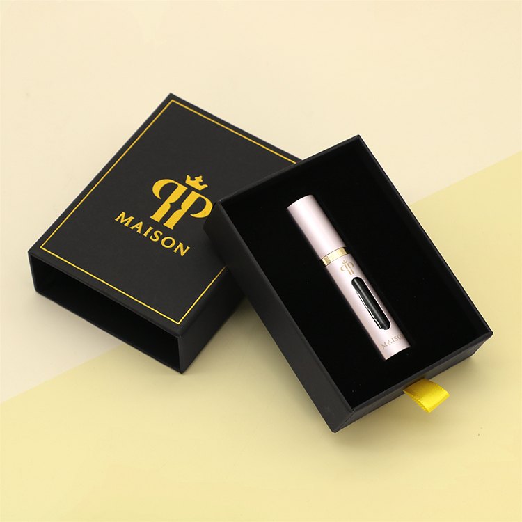
A sliding drawer gives a compact product a distinct opening sequence. Let the sleeve introduce the brand, then reveal the lip product in a controlled position as the tray slides out. This approach gives a signature item its own presentation moment without needing several layers of wrapping.
A pudełko na szminkę should be trialled with the complete container, including its cap. Check how the tube is lifted from the tray and whether the opening action dislodges it. Treat the carton as secondary presentation packaging; it cannot replace the container’s own closure or compatibility checks.
One tactile detail with a defined visual job
A restrained surface treatment can give a simple layout a focal point. Embossing can emphasize a logo, foil can pick out a small motif, and spot UV can create a localized gloss detail. Choose the effect that suits the design instead of applying every available process to one small box.
Our finishing capabilities include foiling, embossing, and UV coating. Review the chosen effect on a physical sample, especially around fine lettering and folds. Keep mandatory product information outside decorative areas that make it harder to read, and retain a quieter surrounding surface so the detail has room to register.
A gift set built around a useful pairing
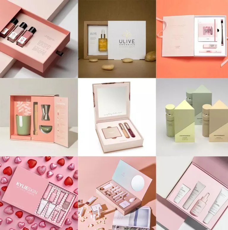
A gift format works best when the products have an understandable relationship. A lip color and matching treatment, for example, can be arranged so the pairing is visible as soon as the lid opens. This is an illustrative design option, not a claim that every combination needs a larger box.
Nasz cosmetic gift box packaging supports customized insert structures and dimensions for beauty sets. When planning several combinations, explore a common outer format with inserts adapted to each pairing. Confirm every filled configuration before adopting that format across the range; an unused cavity should not become the visual center of the gift.
An inside message that helps with product use
The inside lid can carry one useful message after the product is revealed. A short application sequence or a QR code leading to the brand’s instructions can support the product without filling the front panel with explanation. Keep the message specific to the formula and consistent with its approved claims.
A scan test belongs in the artwork review. Check the printed code on the finished surface, confirm its destination on a phone, and keep essential instructions readable without it. For wholesale ranges, make sure the message and destination still match when a shade, formula, or language version changes.
A seasonal accent around a lasting core design
A removable sleeve, ribbon, or gift card can introduce a seasonal theme while preserving the main package’s identity. Keep the core logo and product recognition intact, then use the added piece for the occasion. Compare the assembled package with the everyday version so the seasonal detail does not obscure the product.
Environmental wording needs the same care as the visual design. For US marketing, the FTC Green Guides caution against broad, unqualified claims such as “eco-friendly.” A removable paper sleeve does not by itself establish that the entire package is recyclable or biodegradable. Make only specific claims supported for the actual materials and disposal route.
A small range with a clear design priority
The most useful idea is the one that resolves a visible weakness in the current range. Unclear variants call for a stronger color system; a loose product calls for a better interior; a gift launch may justify a new reveal or pairing. Develop that priority on a filled sample before extending it across the collection.
If you are developing a beauty range, share the product formats and presentation idea with us to explore a suitable packaging design.
Często zadawane pytania
Does every cosmetic product need a different box design?
No. A shared visual system can connect the range while dimensions and inserts suit each container. Keep product and shade identifiers clear enough to distinguish similar packs.
Can a paper box replace the cosmetic container?
The boxes discussed here are secondary presentation packaging. The primary container still needs to suit the formula, close properly, and meet the requirements for the intended product and market.
Which decorative finish should a small brand choose?
Choose the finish that has a clear purpose in the artwork. Compare physical samples with the logo and product information present, then judge legibility, appearance, and handling together.
How can a gift set remain consistent with individual products?
Repeat the core colors, logo treatment, and typography. Adapt the interior to the chosen combination so the gift feels related to the range while presenting the products together clearly.
What belongs in the first packaging sample?
Include the actual container, proposed insert, artwork, and selected finish. For a gift set, use every intended product. Review the opening sequence and printed information as well as the closed appearance.


